Texture is replacing colour
as the new language of luxury.
On the slow shift from chromatic decoration to material depth — and why the most considered interiors are now legible primarily through touch.
The luxury interior has been quietening for a while now. The obvious markers — the single bright accent wall, the high-gloss lacquer, the patterned upholstery used as the room’s focal point — have receded almost entirely from the kind of houses that turn up in serious editorial. What is replacing them is not minimalism, and it is not, in any literal sense, neutrality. The rooms feel quiet only at first glance. Spend a few minutes inside one of them and the room turns out to be doing a great deal — almost all of it through material.
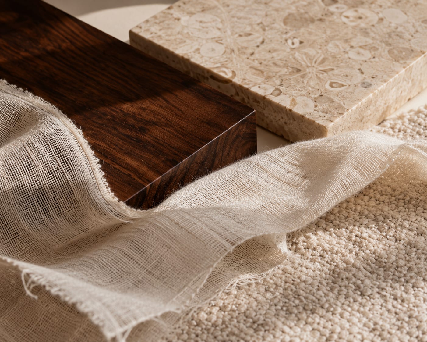
The shift is real and it is not cosmetic. Where a previous generation of designers worked colour as the primary instrument of a scheme, the current generation is working surface. Bouclé and grasscloth, hand-finished plaster and rough-sawn oak, raw linen and woven abaca, leather, stone, hand-thrown ceramic — the register of the contemporary luxury interior is increasingly a register of fibres and finishes rather than tones.
Colour does the obvious work; texture does the slow work.
One way of describing the difference is to think about how a room is read. Colour announces itself immediately. The eye locks onto a strong tone the way it locks onto a moving object — at once, and almost involuntarily. Texture works at a different tempo. It rewards proximity. The grain of an oak, the small irregularities in a hand-finished plaster, the way light catches the loop of a bouclé and is almost entirely absorbed by a length of grasscloth — these are not impressions one receives from a doorway. They are read by walking into the room.
For the kind of client who is now commissioning serious work, the slower reading is the point. They have spent the previous decade at a particular pitch of visual stimulation — phones, screens, the relentless brightness of contemporary cities — and the rooms they want to come home to are deliberately working at a different frequency. The interior has, quite consciously, become a sensory counterweight.
A room read in colour can be understood from the threshold. A room read in texture asks you to come in and stay.
The materials doing the speaking.
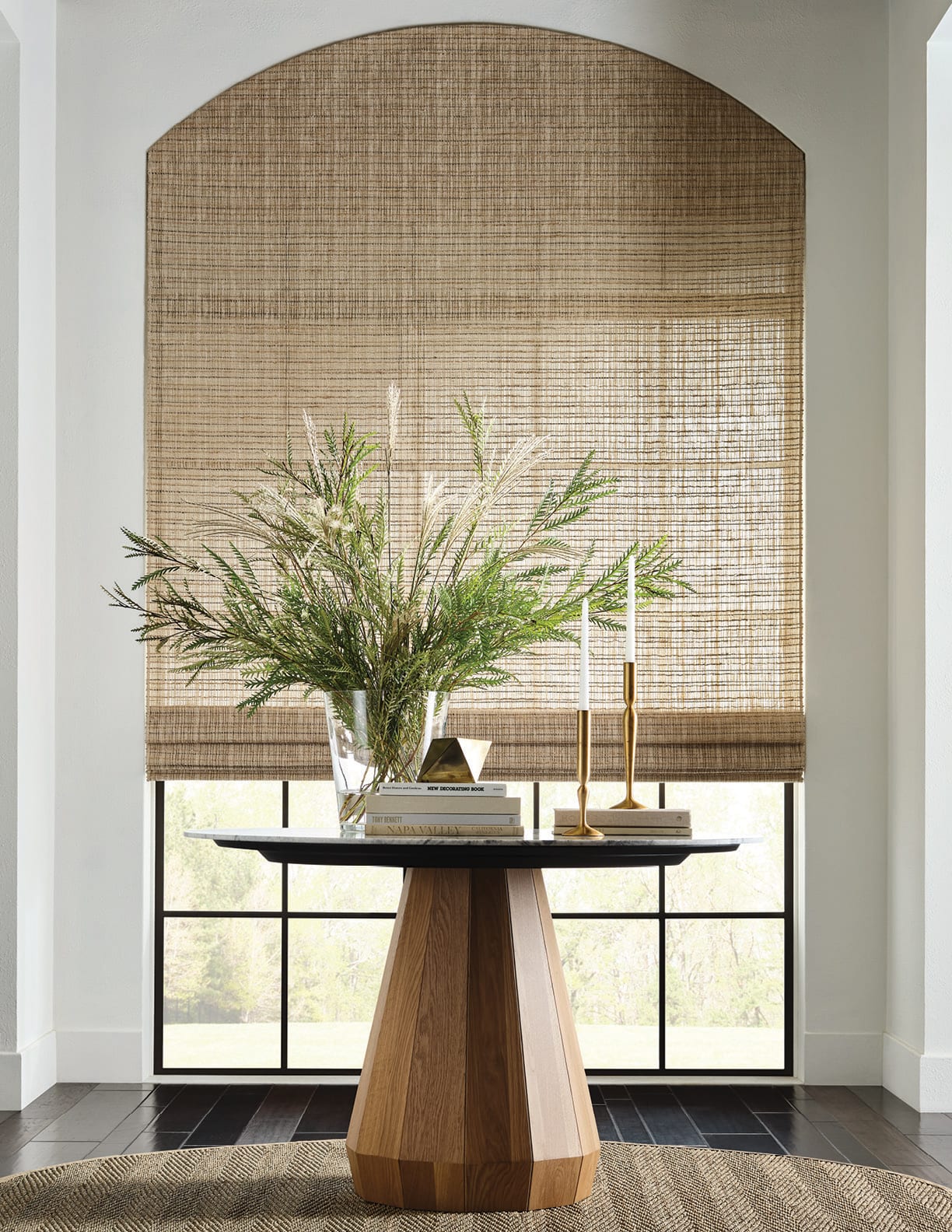
A short list of the surfaces appearing again and again in the interiors that matter just now would include: hand-finished plaster, used in place of paint on principal walls; honed rather than polished stone, particularly on islands and bath surrounds; rough-sawn or wire-brushed oak, allowed to keep its grain; natural fibre window treatments — abaca, grasscloth, jute and paper-yarn — which filter rather than block light; bouclé, used sparingly on architectural seating; and raw or sand-washed linen across upholstery and bed dressing.
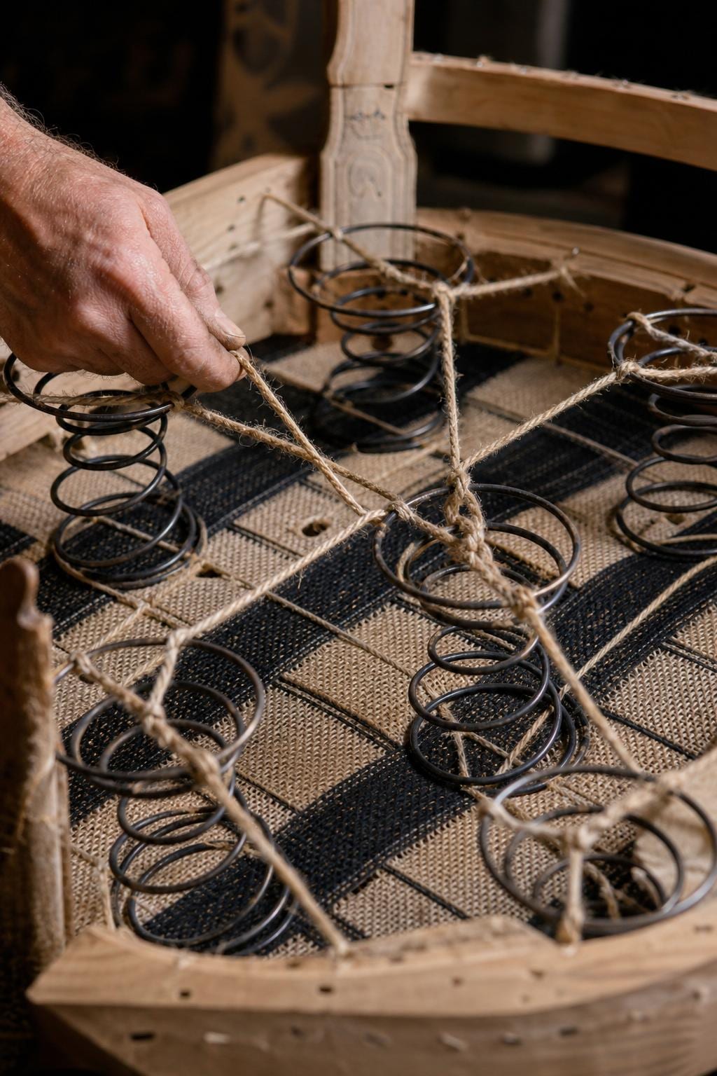
Sitting alongside these are the small craft surfaces that lift the room out of pure fibre — woven rattan and cane on a chair back, a glazed terracotta lamp base, a hand-thrown stoneware vessel, a cast bronze pull. None of them is decorative in any conventional sense. Each is structural. Each is doing material work — providing weight, light absorption, tactile contrast — rather than visual decoration.
The houses that have been working this way longest tend to be the houses that have always been quietly material. The American and European workshops that hand-loom abaca and grasscloth, or weave rattan in small sequences, or finish hardwood by hand, are finding that the rest of the industry is now describing what they have been doing for forty years as the new language of the luxury interior.
Light, after all, is what reveals texture.
The texture-led interior is, more or less by definition, a light-led interior. A bouclé pulled taut over an architectural chair is a different object in morning light from the one it becomes at six in the evening. A grasscloth wall is one shade before lunch and a related but distinctly warmer shade by tea. The room is constantly being remade by what is falling on it.
A flat colour, by contrast, is essentially the same colour at every hour of the day. It is the very efficiency of paint as a material — its consistency — that makes it less interesting in a room intended to be lived in slowly. Hand-finished plaster shifts; lime-washed walls shift; woven natural fibres shift; the wide-grain of oiled oak shifts. The room, in effect, has weather.
This is part of what designers mean when they describe a contemporary scheme as ‘atmospheric’ rather than ‘decorated’. The atmosphere is partly the architecture — proportion, ceiling height, the placement of windows — but it is overwhelmingly carried by what light is falling onto.
The retreat from overt opulence.
What the texture-led interior is also doing, more quietly, is stepping back from the older grammar of luxury. The decorative flourishes that for a long time signalled wealth — gilt edges, high-polish marble, mirror-finish lacquer, the heavy brocade curtain — have begun to feel inherited rather than chosen. They are not absent, but they are no longer doing the principal work. The principal work is being done by surfaces that the eye reads as honest before it reads them as expensive.
This is a real cultural shift. Tactile luxury — the sand-washed linen, the hand-finished plaster, the woven natural-fibre window covering — does not announce itself across a room. It announces itself across a hand. It can only be evaluated by approach, which means the room is, in a sense, more private. The information is held inside the material, available primarily to the people who actually live there.
The aesthetic vocabulary is, almost incidentally, more democratic than the old one. A hand-finished plaster wall is read first as warm, then as well made, and only afterwards — if ever — as a luxury proposition. A high-polish lacquer reads in the opposite order. The shift in register is, in practical terms, a shift in what kind of luxury the room is willing to perform.
A working principle.
The texture-led room can be specified, in the end, around a small set of decisions. A wall finish that absorbs rather than reflects, almost always — plaster, lime-wash, hand-loomed natural fibre. A floor with weight and grain, usually wide-board oak or honed stone. A window treatment that filters light rather than presenting a flat colour against it. Upholstery in materials that improve with use. And a few pieces of wood, bronze, stone or ceramic placed for proportion rather than for ornament.
What the principle leaves out is, in some ways, more interesting than what it includes. There is no instruction about colour. There is no instruction about period. There is no instruction about scale of statement object. The room can be almost any tone, almost any era, almost any size. What it is asked to do is hold its weight in surface.
The most considered rooms now are not the most colourful. They are the ones it takes longest to read.